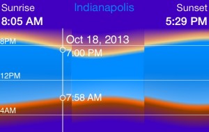
Sunrise’s life started because I was curious about how often my son and I would be standing in the dark while waiting for his school bus in the morning. There are plenty of websites and apps which give the sun rise and set times for the current day, but I wanted to look at a range of dates. There are websites and apps that allow you do this, as well, but as far as I could tell they all only showed the facts for a single date at a time. I wanted a way to see the rise and set times for a range of dates all at once. Thus was born the topmost view in Sunrise:
This view shows the sun rise and set times for the entire year, with the current date in the center. I’m sure I’m not the first to come up with this way to present this information, but I haven’t seen it before. I originally had lines to represent every couple of hours as well as vertical lines with date labels, but this was far too busy. Now you can find the exact sun rise and set times for different dates by dragging across the view. The result is a view that presents a lot of information at once (sun rise and set times for an entire year) in a sensible, easy to understand manner which still allows you to dig down and get to specific information if you want.
In all honesty, I was going to stop at this point. I wasn’t designing a product, I just wanted to see how much time my son and I would spend standing in the dark. But I liked this presentation of the data a lot, and so did everyone I showed it to. Nobody I showed it to had seen anything quite like it before. So I decided to flesh it out and have a go at selling it.
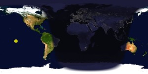
Of course, this view only took about a third of the screen. What should I fill the rest of the screen with? I initially considered a simple table of additional sun facts: the various twilight times, solar noon, etc. But while that information is surely useful to a number of people, it didn’t really feel right for this app. I wanted the app to appeal more to people who are simply curious about the brightest star in our sky and how it interacts with their lives. Once I had made that decision, it was obvious to me what the next bit of information to display would be: the sun light map of the earth:
I always enjoy these sorts of maps, I think they are both fun and informative to play with. I had also implemented one before, though that was a few years ago and I no longer have the source to it. My memory of the math involved was not as good as I had hoped, but eventually I got it together. I used GPUImage with a custom filter (read: fragment shader). The Earth images are taken from NASA’s Blue Marble Next Generation series of images. One neat detail you might miss if you don’t play with the date (by dragging around in the top view) is that the map uses the appropriate images for the time of the year, so you can also see how the earth changes throughout the year.
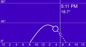
After this, I still had about a third of the display to fill (on tall iPhones in portait orientation - iPad and older iPhone support didn’t come until later). The last bit of information to display was less obvious to me. I finally settled on the sun’s elevation for two reasons: I was fascinated by how low the sun’s highest elevation is this time of the year here in Carmel, IN (~30°) and it gave me a way to allow users to adjust the time of day in the sun light map. So, sun’s elevation throughout the day it was:
Watching how the sun’s elevation chart changes throughout the year is pretty fascinating. Be sure to check it out for locations at very high latitudes, such as Vardø.
I had to spend some time optimizing to get reasonable performance on the iPad 2 and iPhone 4. This project definitely demonstrated why you should never optimize without profiling: only one of the things I thought might be a performance problem was. Several bits of code that I was certain would have been hot spots barely even registered while profiling. Every actual performance issue was a complete surprise.
Sunrise is now available in the App Store, please check it out!


